You are using an out of date browser. It may not display this or other websites correctly.
You should upgrade or use an alternative browser.
You should upgrade or use an alternative browser.
New Top Bar
- Thread starter classic33
- Start date
Elawin
Legendary Member
Doesn't look any different to me, unless the colours have changed from being all green? The "top" button just takes you to the top of the page surely?
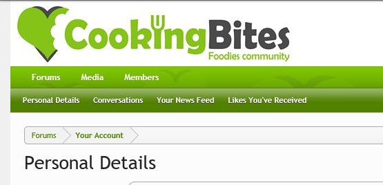
The "Top" button remains on the bar, at the top, doing nothing. ", "Forums" button is new, User ID is missing, Top half of the bar has never shown like that though.Doesn't look any different to me, unless the colours have changed from being all green? The "top" button just takes you to the top of the page surely?
Lynne Guinne
Veteran
Did it look different before?  I have great observational skills in real life; online, not so much. I suppose I should have noticed that the letter "i" in Cooking looked like a devil's pitchfork.
I see that when the page is docked all the way at the top, the "Top" button is gone and the left-most button is the "Forum" one. "Top" doesn't appear until I start to scroll. I've always had a "Forum" button in the top left corner, though. I suppose I would have noticed "Top" had it been there. I also don't remember there being a "User ID" on the left. My name, "Inbox" and "Alerts" buttons are the same as always, on the right end of the top menu bar. This is how it appears on my laptop. I don't use my tablet or phone for Cooking Bites.
 I have great observational skills in real life; online, not so much. I suppose I should have noticed that the letter "i" in Cooking looked like a devil's pitchfork.
I see that when the page is docked all the way at the top, the "Top" button is gone and the left-most button is the "Forum" one. "Top" doesn't appear until I start to scroll. I've always had a "Forum" button in the top left corner, though. I suppose I would have noticed "Top" had it been there. I also don't remember there being a "User ID" on the left. My name, "Inbox" and "Alerts" buttons are the same as always, on the right end of the top menu bar. This is how it appears on my laptop. I don't use my tablet or phone for Cooking Bites.
It used to be, Forums, three short bars, user ID/name, Inbox and Alerts. With Search underneath Alerts.
It's the first time I've had Personal Details showing, without going to the profile page.
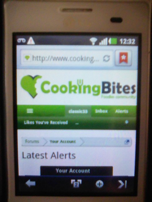
The bar disappears when on handheld, and in the picture I'm at the top of the page.
You missed the seagull by the way.
It's the first time I've had Personal Details showing, without going to the profile page.
The bar disappears when on handheld, and in the picture I'm at the top of the page.
You missed the seagull by the way.
- Joined
- 11 Oct 2012
- Local time
- 12:15 PM
- Messages
- 20,883
- Location
- SE Australia
- Website
- www.satnavsaysstraighton.com
It's been then since way before Christmas. @Shaun launched it when he owned the site. I can find the exact date if you want. It's a floating top bar so that you always have the options available to you without having to scroll all the way back to the top to get to them. It is also context sensitive so that when you are in your personal details, it will show what you are seeing there. When you are in a forum, you will see Mark Forums Read, Search Forums, Watched Forums. Watched Threads and so on..


My best guess is that you are finally on a newer machine that can actually display it rather than the library machines you are sometimes on?
It also varies depending on wether you are at the top of the page (as above) or half way down a page, as below. (So I have gained a Top option here).

And because you were viewing your page of alerts, you are in your account settings (relevant to you and only you), so you get the following when you start to scroll down the page.

What device, OS and web browser are you on? And landscape or portrait please.
My best guess is that you are finally on a newer machine that can actually display it rather than the library machines you are sometimes on?
It also varies depending on wether you are at the top of the page (as above) or half way down a page, as below. (So I have gained a Top option here).
And because you were viewing your page of alerts, you are in your account settings (relevant to you and only you), so you get the following when you start to scroll down the page.
What device, OS and web browser are you on? And landscape or portrait please.
Last edited:
Back to what it used to look like(no changes made, by me) less "Forums" on the left.
Same device, same page. Portrait mode

Both at the top of the page. "Library" computer was nearly always my own.
Same device, same page. Portrait mode
Both at the top of the page. "Library" computer was nearly always my own.
Last edited:
Elawin
Legendary Member
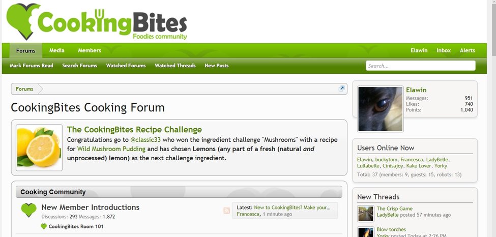
Mine has this on the home page:

followed by this on the threads:

on my laptop. On my phone, everything is shuffled over to show Forums, Menu, ID, Inbox and Alerts, with only Watched Threads and New Posts on the second row.
When I click on Alerts, I get the screen as per your post #1.
Laptop is Windows 10 with Edge, phone Windows 8.1 with IE.
followed by this on the threads:
on my laptop. On my phone, everything is shuffled over to show Forums, Menu, ID, Inbox and Alerts, with only Watched Threads and New Posts on the second row.
When I click on Alerts, I get the screen as per your post #1.
Laptop is Windows 10 with Edge, phone Windows 8.1 with IE.
Last edited:
Shaun
Guru
- Joined
- 4 Oct 2012
- Local time
- 3:15 AM
- Messages
- 919
The 'bar' is responsive, like the rest of the layout, and will display differently on mobiles, tablets and PCs and differently again in portrait and landscape mode. The items change based on the viewport reported from the device (not screen size) and always have done.
I'm not seeing anything different in your screenshots from what is expected.
Cheers,
Shaun
I'm not seeing anything different in your screenshots from what is expected.

Cheers,
Shaun

Any idea why the top of the same page(on the same device and same mode, portrait) gave two different top bars?The 'bar' is responsive, like the rest of the layout, and will display differently on mobiles, tablets and PCs and differently again in portrait and landscape mode. The items change based on the viewport reported from the device (not screen size) and always have done.
I'm not seeing anything different in your screenshots from what is expected.
Cheers,
Shaun
Shaun
Guru
- Joined
- 4 Oct 2012
- Local time
- 3:15 AM
- Messages
- 919
No, sorry. The floating bar with 'Top' in should be automatically disabled for narrow mobile views, so perhaps it was a caching issue or one-time glitch or didn't deactivate for some reason. I can't repeat it in tests. There are sometimes several routes you can take to the same end page, perhaps the floating bar has a glitch for a certain route, I don't know, it's just a possible.Any idea why the top of the same page(on the same device and same mode, portrait) gave two different top bars?
If you can make it happen repeatedly, let me know via PM what you're doing / pressing and I'll see if I can resolve it.

Cheers,
Shaun

